
Nikole Morales
Product & Web Designer

LunR

RHEMArkABLE

Citivise
CFI Research


I’m Nikole Morales, a designer based in the Bay Area, CA. As an avid explorer and learning fanatic, I design to tell stories and educate. There’s many ways to grow, so I always bring curiosity and empathy to each project.
I’d love to design for you! Feel free to contact me through this form or at [email protected]
Playground
Graphic Design, Illustrations, and More
Branding

RHEMArkABLE

Unstoppable God

PadhaiPal

Advertising

Salamat

Posters

In Between (2025)

Buick (2025)

Virtues (2025)

Medusa (2025)

Enlightened (2024)

Roblox Avatar (2024)

Berries (2024)


Padhai Pal

Logo

Shirt (mockup by Tom Delaney)


Team
Me
Shyam Shriram
Timeframe
August - October 2025
Padhai Pal is an Indian nonprofit startup. Their app teaches Hindi literacy using a combination of AI tutoring and ALFA pedagogy.The final logo blends the imagery of a book, peers, and a checkmark into one image. This reflects the platform’s emphasis on fostering literacy, educational growth, leadership, and peer-to-peer support. The use of Roman characters (as requested by the app developers) serves the platform’s goal to expand to other languages. The simplistic font, available in both the Hindi and Roman alphabets, maintains a professional appearance that appeals to educators and parents.
Process

My Sketches (with annotations from team meeting)

Mine (even numbers) & Shyam’s (odd numbers) Logo Iterations


Unstoppable God

Logo
Team
Solo Project
Timeframe
May 2025
Designed for the 2025 women’s ministry retreat hosted by Resonate Church (Fremont, CA).The tsunami, depicted as a wave, represents the unstoppable force of God’s will, grace, and love. The various forms that compile into the overall icon represent community. A muted color palette maintains a mature theme suited for the adult retreat-goers. The use of a blue palette ties into the Blessed Virgin Mary, Mother of God and a highly important female figure in Christianity. The typography is bold, tying into the theme of force. Yet, it is sharp, as to not detract from the icon.This logo appears on various merchandise designs, including decals and shirts.
Merchandse
Salamat
Billboard Design

Social Media Graphic

Billboard (located in Oakland)


Team
Solo Project
Timeframe
February - April 2024
A submission for the 2024 Inspire Oakland Design Challenge. Inspired by the Oakland-based Filipino restaurant, Lucky Three Seven. I named the design Salamat (Tagalog for "thank you") as my design was a visual thank-you note to Lucky Three Seven and its founders (especially the late co-founder Jun Anabo) for their impact on the Filipino and Oakland communities.At the conclusion of the Inspire Oakland Design Challenge (May 2024), the judges selected my design as one of the six to be printed on a real billboard. Salamat was located in Fruitvale, the same Oakland neighborhood as Lucky Three Seven.
Connecting Designers of Color Through LunR

Team
Me (UX Research & Visual Design)
Anthea Tan (Team lead)
Aiko Tanaka (UI Design)
Thania Valencia (Content Design)
Timeframe
July - August 2024
Black creatives are one of the least-represented racial groups in the tech industry.
To tackle this issue, the Tech Equity Collective (a Google initiative), aims to double the number of Black people in tech by 2030. Similarly, BRIDGEGOOD, a Bay Area nonprofit, strives to provide education and professional opportunities to designers of color.In collaboration with the Tech Equity Collective, BRIDGEGOOD challenged my team to design an app to empower Black creatives with accessible resources and opportunities to ensure more Black creatives enter and thrive in the tech industry.Click here to jump straight to the prototype.
Research
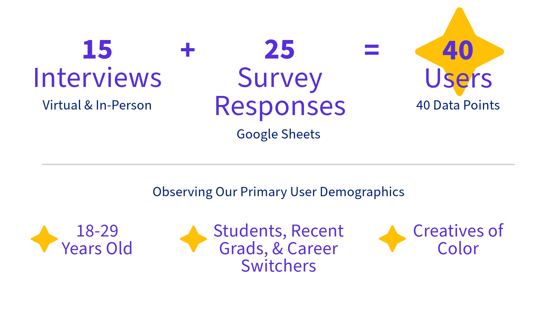
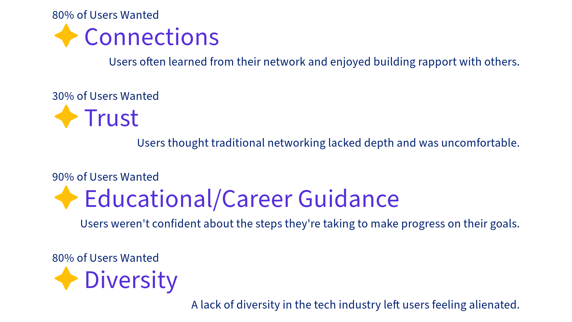
Out of a pool of 40 users, we roughly estimated that:
User Persona

Name: Renee
Pronouns: She/Her
Age: 20
Occupation: College student
Goal: Become a designer in the tech industry
Pain Points:
ADHD & lack of diversity in the tech industry
Defining Insight: "Out of sight, out of mind." (A quote from multiple users who described how mental health struggles make networking difficult.)
Key Features

Scheduling

AI-Integrated
Messaging
Interest and
Intent Indicators


Scheduling: Users can craft invitations for in-person or online hangouts to send to each other.
This helps users access flexible opportunities to build rapport and connections.AI-Integrated Messaging: Users can use AI to draft greetings.
This mitigates anxiety around starting conversations.Interest and Intent Indicators: Users can publicly indicate on their profile their interests and goals for connecting with others.
This helps users build trust with a diverse group of people who fit their goals, whether it be as a potential mentor, collaborator, or friend.
Lo-Fi Prototype
User Testing Feedback
After 2 tests, we found that:
The user flow was unclear.
It was unclear that the carousel in the introduction screen was interactive.
Revisions
To solve the issues with the Lo-Fi prototype:
Colors were added to icons to direct the user.
A swiping animation was added to the introduction screen as a CTA.
Hi-Fi Prototype
Impact: Users
My team and I predict that ultimately, LunR would:
Help users become 20% more consistent with maintaining connections by allowing users to easily make flexible plans to meet in their preferred setting.
Make messaging 30% less stressful by using AI to mitigate anxiety around cold-messaging.
Allow users to feel 45% more comfortable with their network by helping users to tailor their community to meet their need for trust and diversity.
Ensure users have a 25% increased likelihood of finding resources by allowing them to connect with industry professionals, educators, and fellow creatives who may have knowledge of/access to beneficial educational/career-building resources.
Impact: Business
My team also predicts that LunR would pose the following benefits to our backer (BRIDGEGOOD):
Expand company outreach by 50% by keeping the BRIDGEGOOD community connected and open to inviting others to join.
Increase the alumni community by 40% by providing a welcoming and accessible platform to maintain contact with former colleagues.
Foster 20% of alumni to become future donors by ensuring alumni remain in the BRIDGEGOOD community, making them more likely to provide support.
Find trustworthy partners by ensuring that users are invited by an existing member of the community.
Next Steps
Integrate external apps like Google and LinkedIn for login options and suggested connections.
Integrate notifications.
Perform accessibility tests and make subsequent adjustments.
Expand language access to the five most spoken languages worldwide.
Implement a forums feature for users to share resources outside of private messages.
Takeaways
I've learned that in future projects, I should:
Narrow down the focus of a product and identify its key features.
Focus on accessibility from the start of the design process to ensure all CTA's can be noticed and followed by any user.
More projects
Providing Pediatric Speech Pathology Care with RHEMArkABLE

Team
Solo Project
Timeframe
April - May 2025
Carmelie Jadman is a pediatric speech pathologist from the East Bay, CA. She recently started her independent practice, RHEMArkABLE, and wanted a website to promote her practice and encourage bookings.Click here to jump straight to the prototype.
Key Features
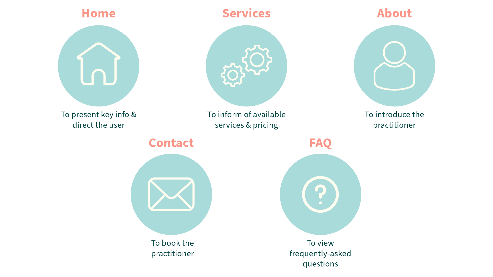
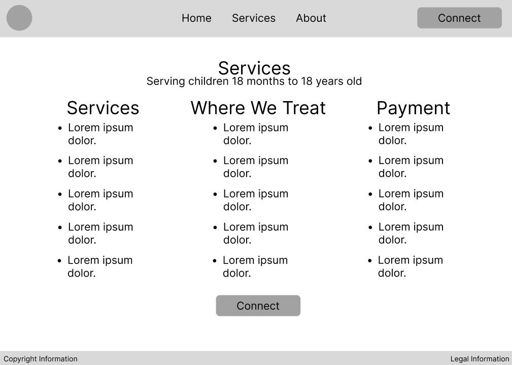
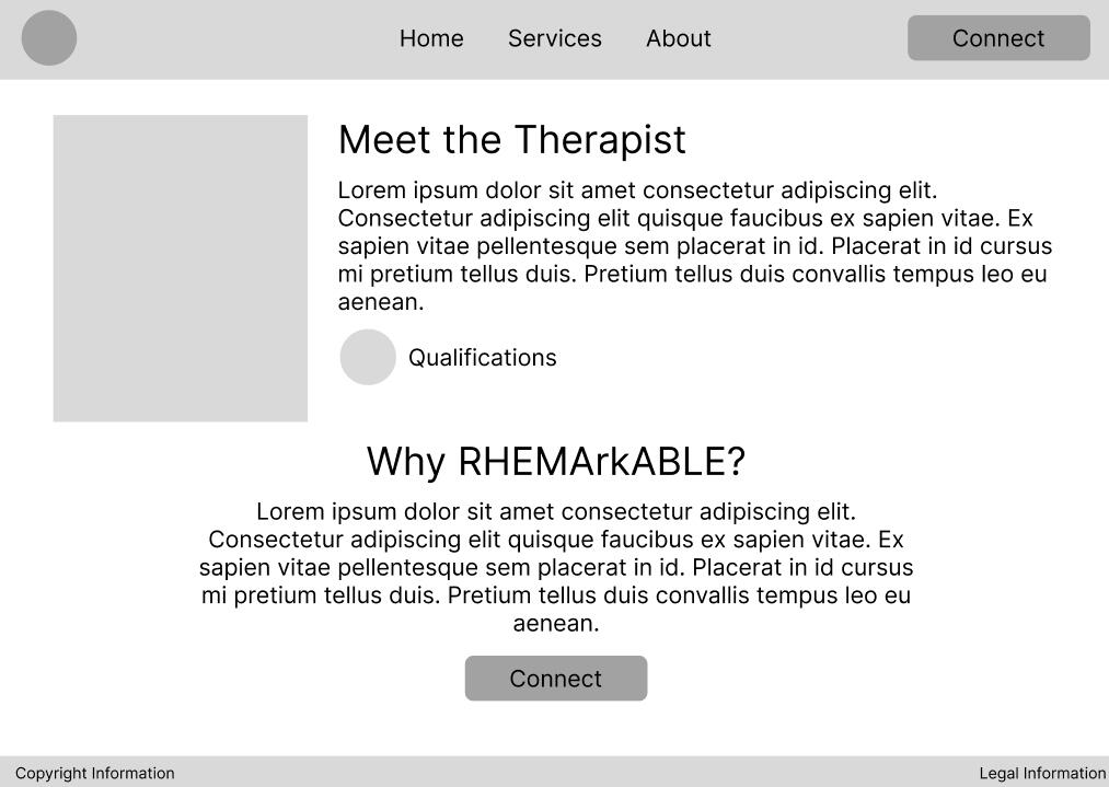
During our first meeting, the client stated that she wanted the website to include the following sections:
Lo-fi Mockups

Home

Services

About

Contact & FAQ


Possible page layouts that were featured in the Style Survey
Style Survey
In an online survey with 19 participants, I found that:

Final Website
Built in Squarespace
Next Steps
Integrate a Calendly or information about available appointment times.
Incorporate more testimonials.
Add links to social media accounts.
Takeaways
I've learned that in future projects, i should:
Develop creative ways to reach potential research participants.
Make sure each element on a page has a function that better informs/serves the user.
more projects
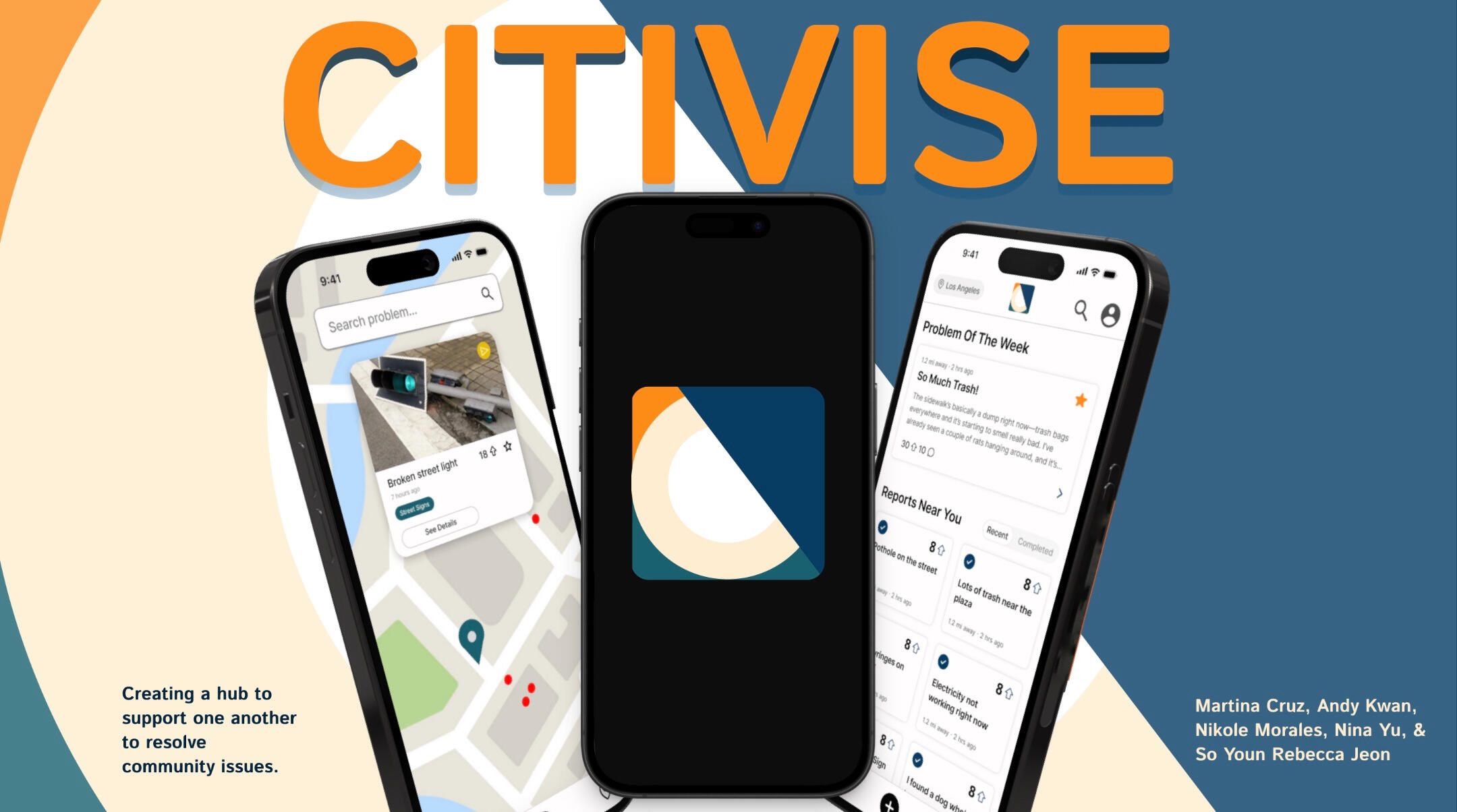
Communities Combating Civic Issues with Citivise
Team
Me
Rebecca Jeon
Andy Kwan
Nina Yu
Martina Cruz
Timeframe
May 10
Completed within 24 hours during the 2025 DubsTech + Design Buddies Protothon
As participants of the 2025 DubsTech + Design Buddies Protothon, my team and I were given the following prompt for teams who chose the City theme:"Your task is to design a citizen-facing mobile application that bridges this communication gap. The mobile app should:
1. Empower citizens to report city-related issues easily, transparently, and visually.
2. Enable citizens to view all issues reported by them and others and track the status of the sameNote: You do not need to design the government facing experience of viewing and managing these projects."Click here to jump straight to the prototype.
Needs & Suggestions
The prompt detailed various needs to keep in mind, including various suggestions of features to address said needs:
A detailed reporting system that categorizes reports and mitigates duplicates
The ability to engage with reports with voting, commenting, filtering through a reports directory, or through viewing a map
City selection system for new users
Features that emphasize government transparency and tracks progress on problem-solving
Key Features
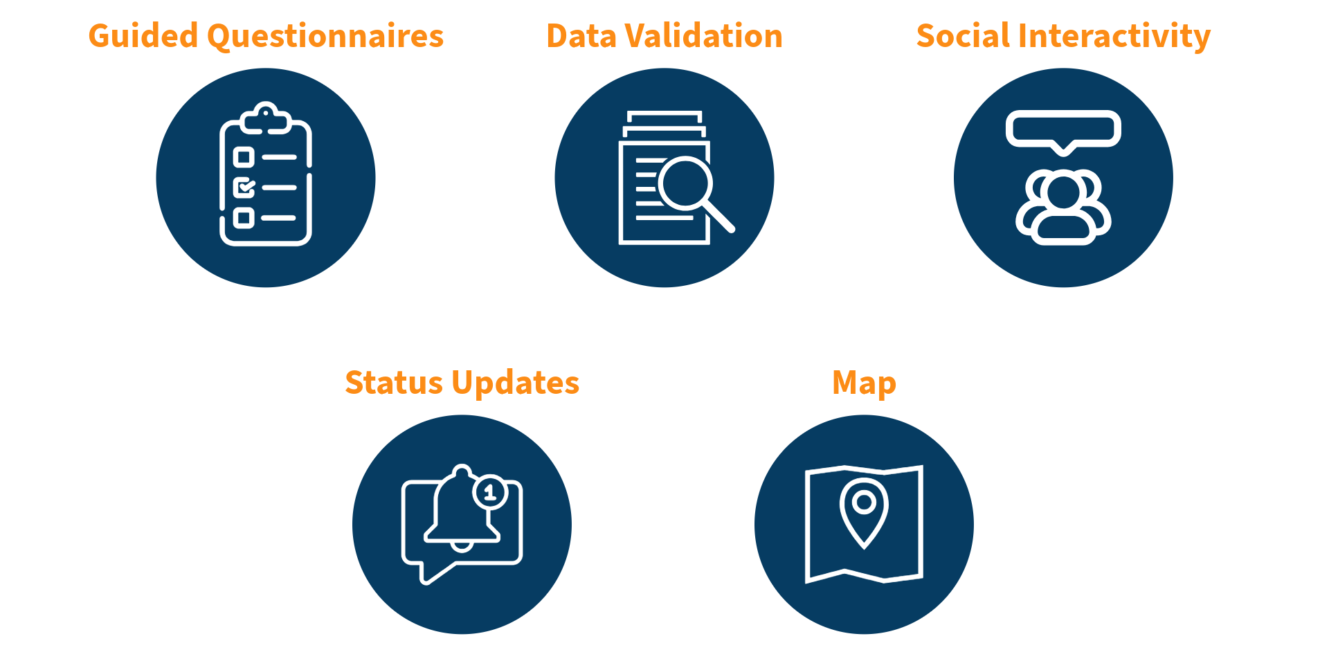
Based on the needs detailed in our prompt, the key features we included are:
Guided Questionnaires: Allows users to submit detailed reports of issues in their city.
Data Validation: Prevents duplicate reports by alerting users if their report matches another and suggesting alternative actions.
Social Interactivity: Increases the visibility of reports with online forum interactions such as voting and commenting.
Status Updates: Improves governmental accountability by informing users of the progress on their reports.
Map: Protects users by showing them the reported incidents in their area.
Prototype
Next Steps
To further improve the prototype, our team could:
Create an onboarding flow
Develop a strong user engagement strategy, such as through badges
Refine the screens for visual consistency
Takeaways
Through this project, I've learned:
Provide a clear standard flow for users
Have a plan to retain user engagement
Ensure a product's story is clear and in-depth
more projects
UX Research for Christians for Impact

TEAM
Me (Assistant UX Researcher)
Alex Voica (Lead UX Researcher)
Timeframe
July - August 2025
About Christians for Impact
Christians for Impact is a global nonprofit organization dedicated to ensuring Christians find careers that are spiritually fulfilling and leave a deep positive impact on society. Their platform includes research-backed guides, insight from professionals across industries, and 1-on-1 career advising.
Purpose of this study
The purpose of this study is to learn what CFI users think about CFI's platform in order to improve the overall experience, especially regarding the website. CFI’s staff hope to use these insights to improve how CFI helps people find meaningful and impactful careers.
Roles & Responsibilities
Alex (Lead UX Researcher)
Recruit participants using social media and a survey
Develop an interview guide
Conduct user interviews (she took notes for two interviews)
Me (Assistant UX Researcher)
Familiarize myself with existing materials (survey, website, and social media)
Brainstorm possible interview questions
Take notes during interviews (I conducted two interviews)
Timeline
| Early June | Participant recruitment through social media & survey |
| June 16 | Initial discussion guide ideation |
| July 7 - 8 | Discussion guide finalization |
| July 14 - 24 | User interviews (14 total) |
| July 30 - August 12 | Data analysis & synthesis |
| August 12 - 20 | Deliverable preparation |
| August 20 | Presentation of research to stakeholders |
Research Questions
How and why do users come into contact with CFI?
How are users’ experiences with CFI’s website?
How are user’s experiences with CFI’s other platforms?
How are user’s experiences with CFI’s advising services?
Success Criteria
Determine clear patterns between user’s introduction to CFI and their interaction behaviors with the platform
Define user pain points and highlights within all aspects of the CFI experience
Methodology
1-on-1 Interviews (with silent notetaker)
45 Minutes
Held on Google Meet between the hours of 7 - 11 AM PST / 3 - 7 PM GMT
US & UK ParticipantsThese sessions included:
1. Semi-structured interview: focused on user background, experience with CFI, and career challenges.
2.Usability testing: focused on observing user patterns and finding pain points with the CFI website.Test Prompt:
“Imagine you are thinking about pursuing an impactful career or transitioning to something more impactful, and you visit Christians for Impact for guidance, advice, or inspiration.”We chose to conduct qualitative interviews to gain in-depth information regarding the experiences of users. Additionally, interviews provided the opportunity to receive suggestions that can be easily translated into actionable improvements to CFI's platform. Such interviews also provided quantitative data regarding demographics and the means of introduction to CFI.We chose to conduct unmoderated usability tests to observe users' natural behaviors toward the website. By encouraging participants to voice their thoughts out loud, we could observe their authentic reactions to the website. These tests also provided quantitative data regarding the frequency of page visits.
Interview Recruitment
Users were recruited following the completion of a survey in which they indicated their demographics (location, denomination, etc.), interests, struggles, and interest in an interview.
Interview Questions Samples
Approximately how much time have you spent on CFI’s site or resources?
What piece of content or resource was most helpful to you?
Synthesis
We synthesized the data through multiple rounds of using Notebook LM and reviewing the resulting information. We did this for efficiency and to ensure we didn’t skip any informations while reviewing the interview notes.When using NotebookLM, we used specific prompts to focus on different categories pertaining to the discussion guide structure (user context, usability test, etc.).Through this process, we determined:
Frequency of entry-point methods.
Common (among 3+ users) first impressions of the website.
Website pain points.
Website highlights.
Common suggestions to improve the website.
We debriefed to review and discuss these findings before compiling our insights into a deliverable.
Deliverables
We delivered the research report via a slideshow presentation over Google Meet to CFI’s founder and staff.Below are a few slides that are censored. The complete presentation is not available for public viewing.
Impact
CFI’s founder and staff are now informed of general user impressions regarding CFI’s brand identity, social media content, website, and career advising services.Regarding the website, there were several actionable insights that CFI’s founder agreed warranted implementation. These adjustments should increase retention rates among users and increase engagement in advising services.Regarding CFI’s identity, which was a common query from interviewees, there is the potential for CFI to further solidify its identity through refining its content. This will help CFI stand out against other nonprofits of similar nature and draw users to CFI’s platform.Regarding the career advising process, fixes to the website will improve visibility and clarity. Further tailoring the advising process to the user will increase satisfaction rates and further CFI’s goal to support career-seeking Christians.
Next Steps
Determine which actionable insights are within the scope of CFI’s resources and ability.
Implement actionable insights that improve the CFI website.
Conduct further evaluation of user feedback regarding social media content, written reports, and advising.
Reflection
I was surprised to find how these interviews produced detailed insights regarding almost all aspects of CFI’s operations. I think pursuing deep user context benefitted the project as it informs us what user needs CFI may fulfill.I think the project would have benefitted from gathering more users, as each interviewee often had unique insights, making it difficult to spot consistent pain points or highlights.Both I and CFI’s stakeholders found this project to be beneficial in understanding areas where CFI can improve the user’s experience. Thus, we fulfilled the purpose of this study.
more projects
Resources
What I use to Create
Tools
MSI GS66 Stealth 10SF
iPad 9th Generation
Programs
Adobe Illustrator
Figma
Procreate
Carrd
Recommended Resources
I've tried and personally recommend each resource listed below.
Design
BRIDGEGOOD: A non-profit dedicated to educating Bay Area designers.
NotebookLM: A platform that helps with efficiently analyzing multiple sets of information.
Adobe Learn: A collection of tutorials for Adobe programs.
Mental Health
Kooth: A platform that provides free mental health education and support.
Never a Bother: A platform with guides for handling suicidal ideation in oneself and in one's loved ones.
Comfort: A space to take a cozy mental health break.
Positive impact
Random Acts of Kindness: A website with various guides to foster kindness in schools, workplaces, homes, and in one's everyday life.
Next Voice: A website that teaches how to advocate for social change.
80,000 Hours: Online career guidance.
Welcome to the
Playground!
Verse sharing
Micah 6:8
He has shown you, O mortal, what is good.
And what does the Lord require of you?
To act justly and to love mercy
and to walk humbly with your God.
Fruit Stand

Bonana
Stwaby
Mangho


Roblox Fits

05.06.2025

06.10.2025
This page is a placeholder.
Stay tuned!